Animated wicked CSS3 3d bar chart
Do you remember the Wicked CSS3 3d bar chart that I placed online a couple of weeks ago? Paul Irish left a comment, requesting for an example with transitions. My reply was that I was already working on that, and today I'm proud to release the animated wicked CSS3 3d bar chart.The principle is the same as the previous version: Create a beautiful 3d bar chart. But this time, we don't create a "stacked" one (since animation would be hard), but several bars placed under each other. When hovering, the animation shows and the bar will grow to the appropriate size.
How To Create Depth And Nice 3D Ribbons Only Using CSS3
In this last period on PV.M Garage we have described many trends of the modern Web Design and many techniques for creating stunning and impressive web sites.In one of our tutorials we learned how to realize a nice 3D ribbon and how to play with the drop shadow in Photoshop to simulate depth in a web design layout. This is a widespread trends in recent web design: creating a 3D perception in a website and simulating a �world� in three dimensions are two great ways for the designers to play with their skills.

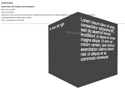
Animated CSS3 cube using 3D transforms
Last week Web�Kit included the much anti�cip�ated (at least on my part) 3D trans�forms in its latest nightly build, announced prac�tic�ally along�side the awe�some Snow Stack demo that provides a 3D inter�face for brows�ing Flickr images (use left, right and space-bar). Today the Surfin Safari blog has updated with some more excit�ing demos, includ�ing �Morphin Power Cubes� and �Poster Circle�. It is now pos�sible to cre�ate all sorts of crazy three-dimensional and anim�ated user inter�faces; the power comes largely in -webkit-perspective and a num�ber of updated trans�forms?�?adap�ted to incor�por�ate the Z axis.
CSS 3D Meninas
I�ve took the classic paint The Maids of Honour (Las Meninas) and made this CSS pseudo-3D/parallax effect. It is pure CSS, so no javascript or flash involved: only CSS and HTML code.It has been tested and it is working on Internet Explorer 8, Firefox 3, Opera 9, Safari 3, Chrome 4 and Konqueror 3.5, and it validates.
3D transforms in Firefox 3.5 � the isocube
This demo was created by Zachary Johnson, a Minneapolis, MN based web developer who has also authored a jQuery plugin for animated �3D� rotation.I�d like to show an example of a visual effect that can be accomplished using the new -moz-transform CSS transformation property that is available in the Firefox 3.5 browser. I was very excited to see this feature added to Firefox because I knew it would allow me to produce a faux-3D isometric effect, also sometimes called 2.5D. I created a demo where HTML content is mapped onto the faces of a �3D� isometric cube:
3d animation using pure CSS3
A couple of days ago, somebody tweeted a great looking CSS3 example. I was absolutely stunned by the example And all that Malarkey created and was wondering how he was able to produce that kind of effect. I knew about the CSS3 transition property, but how to create that 3d effect?At that point, I started digging through the Safari Reference Library, where I eventually found the Safari CSS Visual Effects Guide: Transforms page. This page describes a CSS property I've never seen before: -webkit-perspective.The perspective property is what we need to create the 3d effect. Using transform and transition, we can create 3d animation using pure CSS3.
Css3 Cube

Multiple 3D Cubes with animation using CSS


0 comments:
Post a Comment