Typography is often overlooked in todays design specifically by web developers. It really is a shame because CSS gives us so much control over our type. That being said, we our limited to certain �web safe� typefaces but that shouldn�t decrease our creativity. Here are a few
CSS tips for typography on the web.
Typography on the web is anything but simple, and for many, it is a troubling mystery. Today, we�re going to review six ways that web designers and developers can improve the typography of the sites they create.
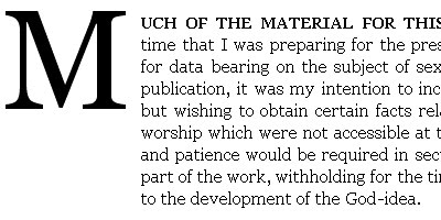
These are supporting examples for the blog entry, The Paragraph in Web Typography & Design.Only standard tags have been used. Some of these styles are experiments using pseudo elements and adjacent sibling selectors; browser support is not consistent. Paragraph font size is set at 1em (equivalent to 16px if browser font size is unchanged) and line height set at 1.25em. Georgia was used exclusively. No browser specific CSS has been used�any inconsistency in the rendering of line-height, baseline and element positioning has been left for cross browser comparison before implementing.
While Firefox 3.0 improved typographic rendering by introducing support for kerning, ligatures, and multiple weights along with support for rendering complex scripts, authors are still limited to using commonly available fonts in their designs. Firefox 3.5 removes this restriction by introducing support for the CSS @font-face rule, a way of linking to TrueType and OpenType fonts just as code and images are linked to today. Safari has supported this type of font linking since version 3.1, and Opera has announced that they plan to support it in Opera 10.
The blockquote XHTML tag is a fairly useful (if somewhat underused) element. Semantically speaking, a blockquote should be used any time you�re quoting a longer piece of text from another source � another speaker, another website, whatever. It�s a way of setting the text apart, and showing that it came from some other source. Stylistically, you could accomplish all this with a special class on your paragraph tags� but that wouldn�t be as semantically useful, now, would it?

This is a quick experiment that reproduces an image from I Love Typography using nothing more than simple semantic HTML, CSS2.1, and modern browser implementations of a couple of CSS3 properties. Along the way a few new browser bugs and inconsistencies were exposed.

There�s been a welcome resurgence of interest in web typography over the past year or so, with many articles and conference talks offering techniques and theory. Frequently asserted is the notion that good typography requires accurate control of font size and line-height. But this is the web: it�s a special medium where the reader can have as much control as the designer�the implication being that text on the web, while bending to the designer�s will, must also be reliably resizable across browsers and platforms.
Typography is a very important element to design, and it�s quite a shame that for the past decade we�ve resorted to using images to display this element, without having the flexibility to define different fonts outside of the 13 or so web safe fonts. In the past few years, however, we�ve seen a growing trend towards forcing new typefaces on the web. CSS defines a property for browsers to support a property called @font-face which lets the developer define new typefaces and include the original font file for the browser to download and render the site with. Support for this feature has been implemented in Safari already and is due to release with the next versions of Firefox and Opera. Though this is definitely good news and progress in the right direction, a few issues stand in the way


0 comments:
Post a Comment