25 Helpful Photoshop Tutorials For Creating Retro & Vintage Typography.
Creating A Retro Grunge Poster
This tutorial is an add on from the Poster article the other day, we will create a Retro/Grunge style poster using the pen tool some textures and playing with text to make it look more retro,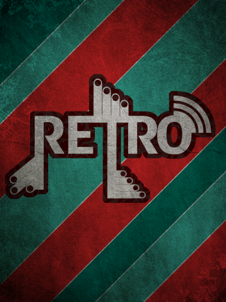
Create a Wicked-Worn Vintage Pop Art Design
Pop art is alive! As I�m a big fan of grunge style, I�ll show you how to design a simple but nice vintage pop art piece with some wear and tear. This is a basic to intermediate tutorial, so you don�t need to be a guru to work with this effect and get an awesome result!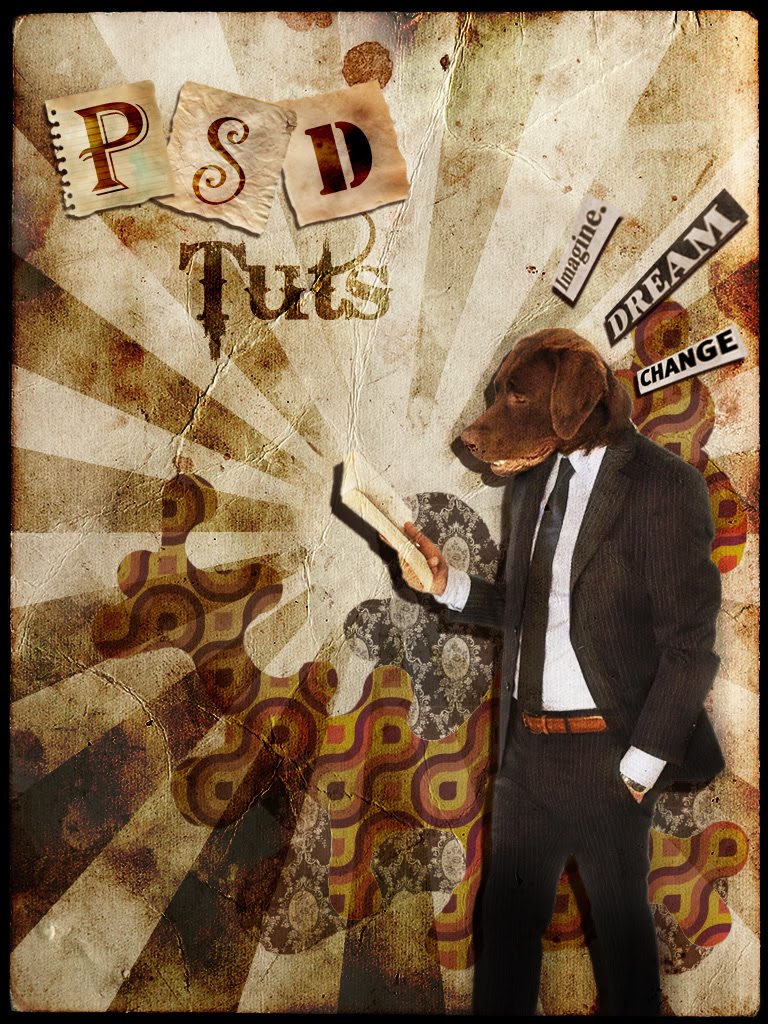
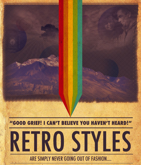
Design a Retro Styled Poster
Design a Vintage Car Poster with Grunge Texture, Font and Brushset in Photoshop
Along the way, we will be using a series of Photoshop techniques such as layer blending options, image adjustments, filter effects and masking. Some of the techniques can be a bit tricky (especially with the Pen Tool), but why not just have a try :)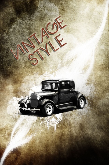
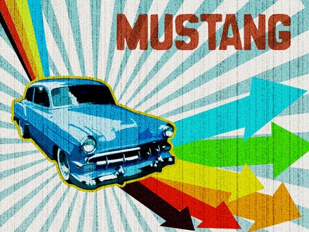
Retro Lighting - Ford Mustang
Create a 60's Psychedelic Style Concert Poster
In this tutorial, we will go through the steps to create a retro 1960s psychedelic concert poster. This tutorial relies heavily on the use of the Warp Tool, but includes a few other techniques as well. Let�s get started.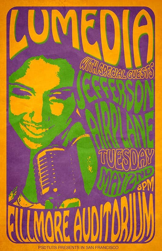
Design a Rocket-Powered Retrofuturistic Digital Illustration
Retrofuturism is a topic that has always fascinated me. In this tutorial, we�ll go through the steps of recreating my own experiment in this style. After making the 3D typography in Illustrator, we�ll use Photoshop to create an out-of-this-world digital illustration on the topic of space exploration.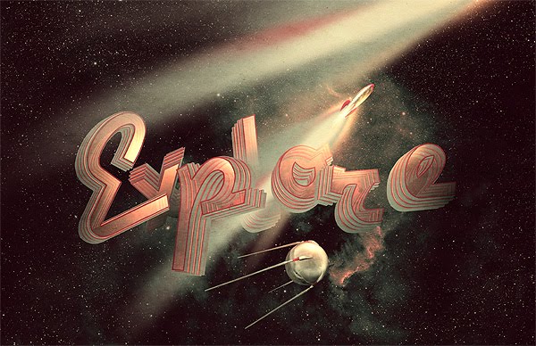
Super Cool Retro Poster in 10 Steps in Photoshop
So in this tutorial I will show you how to create a very cool poster in just 10 steps. We will use Adobe Photoshop and Illustrator, but you may use other tools. I'm working on the Pixelmator version as well.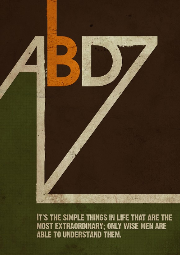
Create a Retro Metal Text poster in Photoshop
In this tutorial we are going to create a retro/grunge looking metal text using some basic Photoshop techniques as well as a texture. We are going to then finish off the image using another texture and a few other techniques to bring the whole image together.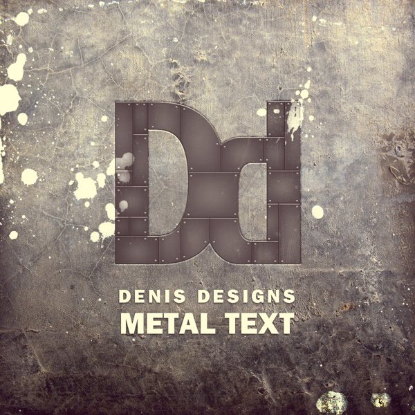
How to create a retro-style text effect in Cinema 4D and Photoshop
In this tutorial I�ll explain how to easily create a 3d text and merge it into a retro-style scene. We will use Illustrator for the text, Cinema4D to make this text 3D and Photoshop for all others remaining steps.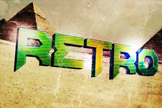
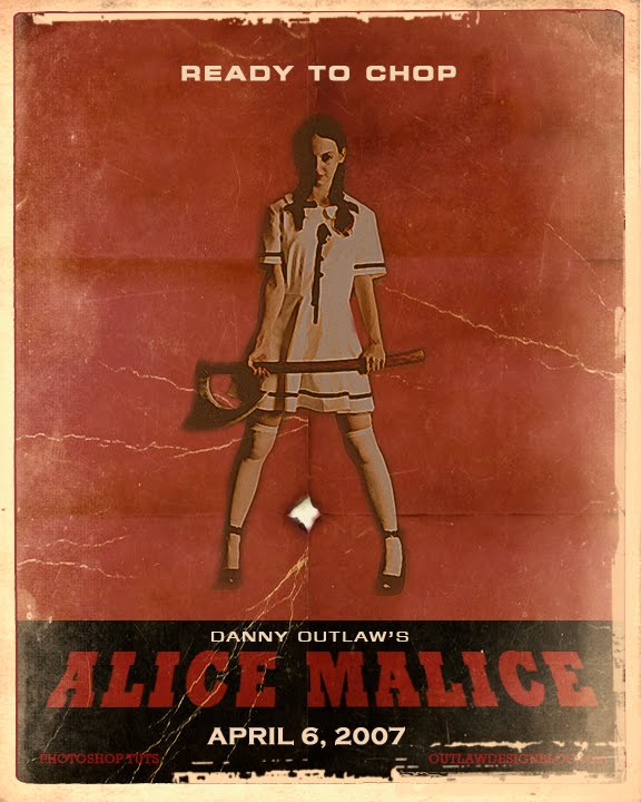
How to Make a Planet Terror Style Poster in Photoshop
Blue Retro Grunge Text Effect
In this Etc Tutorial we will be creating a blue retro grunge floral text effect. This text effect is vary versatile and looks good on a variety of fonts and Photoshop shapes.
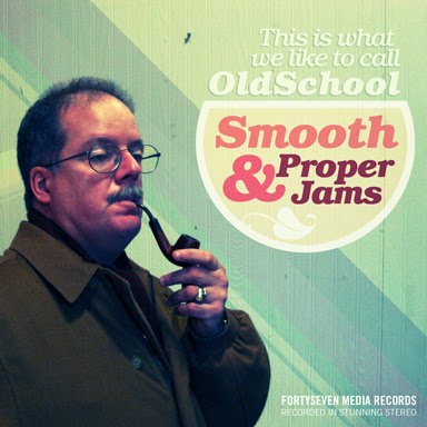
Retro Photoshop Fun - From Dull Digital Photo To Sweet Old School Album Cover
Gigposter Design: The New Sex
A lot of people are making them. A lot of people suck. We don�t suck, and neither do you. This tutorial requires NO drawing talent� so don�t trip folks.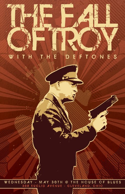
How to Design a Rockin� 80's Party Poster
In this tutorial, I�ll show you how to design a poster for an 80's anthem party. Throughout this tutorial, we�ll create some textures for background, manipulate a photo to give it a stylish look, and make some color variations. Let�s jump into this super rad tutorial.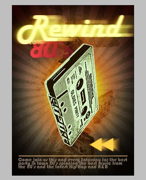
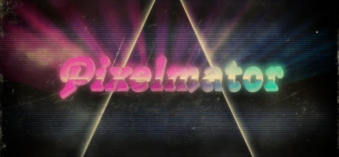
80's Style Text Effect in Pixelmator
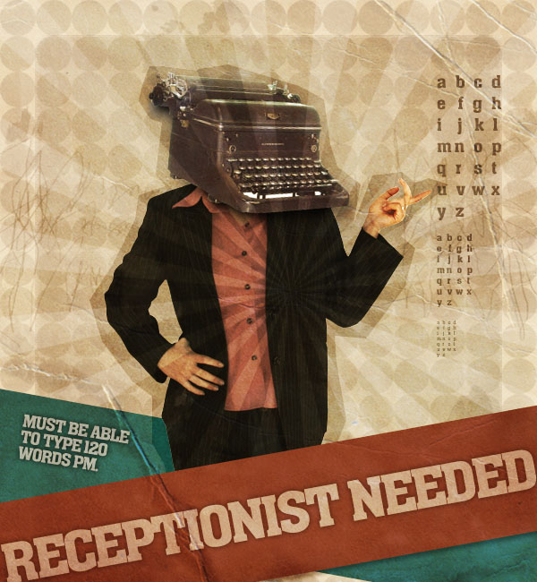
Create a Mock-Retro Poster Concept
Craft a Vintage Fifties Letter
It seems everyone wants to learn how to make something look vintage or grungy. In this tutorial, I go over how to create a fifties love letter with stamps, bent corner, and a a retro border using the brush engine, rectangle tool, layer styles, blend modes, and several intermediate techniques that are sure to propel you skills to the next level.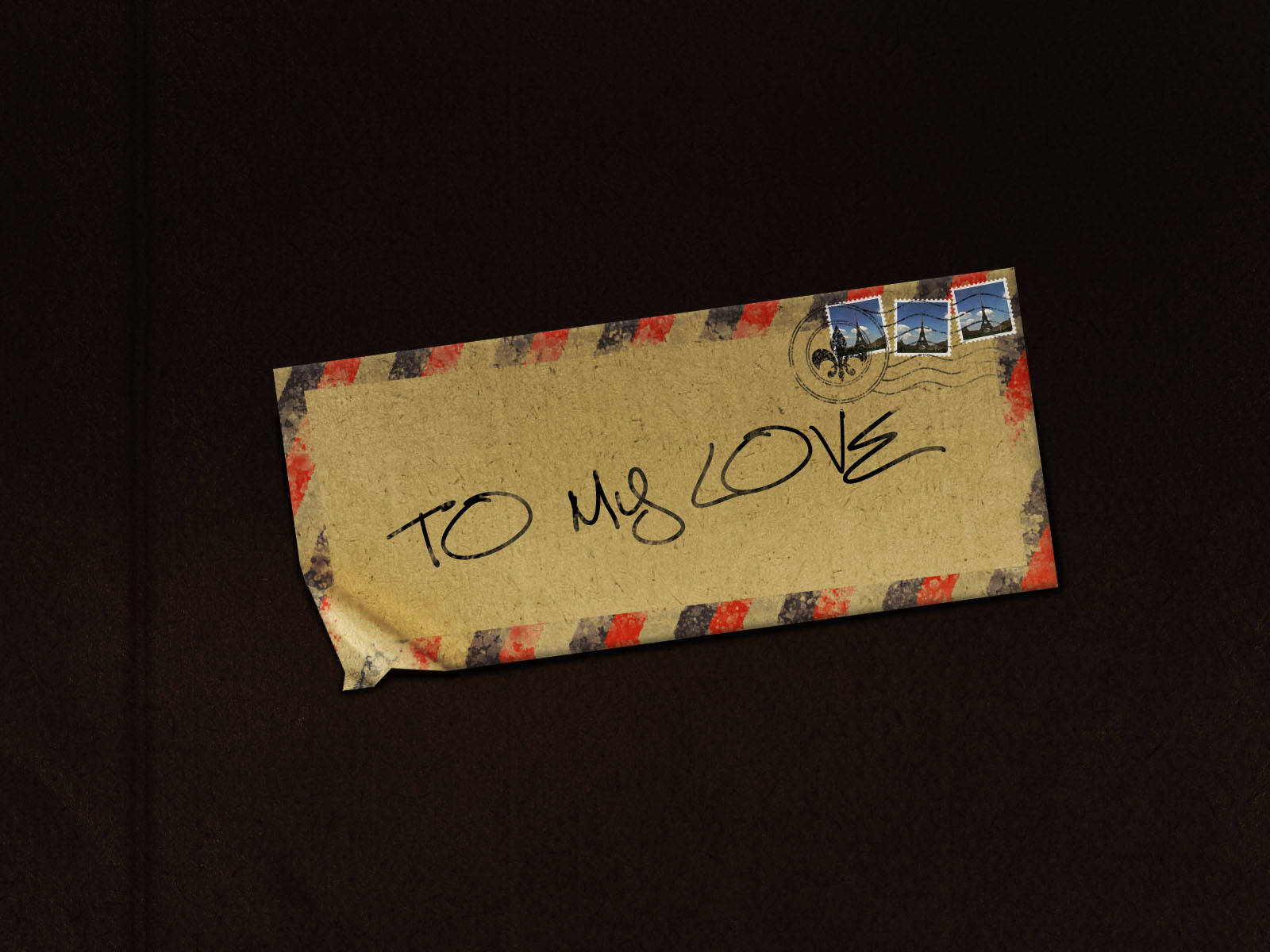
Make a Retro-Space Typography Poster with Colorful Lights
In this tutorial, you are going to learn how to create a stunning and high-impact retro-style typography poster that�s out of this world (literally).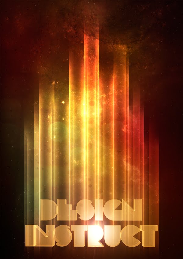
Create a retro grunge typographic poster in Photoshop
Retro and Grunge are quickly becoming a new trend. These type of designs are becoming more and more popular in a variety of design contexts like corporate designs, portfolios, poster work and nowadays, even blogs use both styles on a small and large scale. 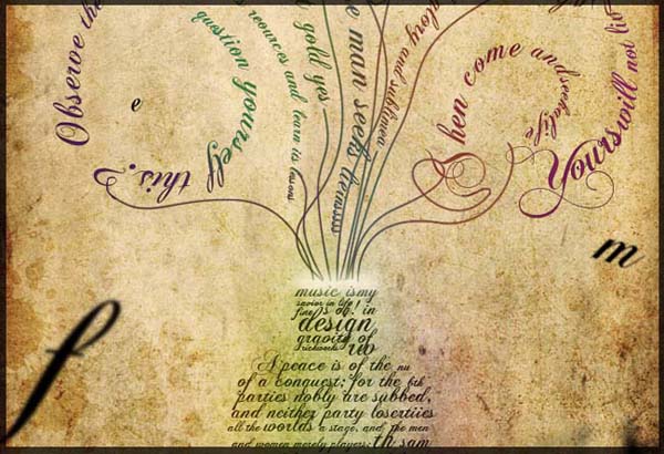
How to Quickly Create a Stylish Retro Text Effect
n this tutorial we will be designing a cool retro text effect, which is growing more and more popular in today�s design. Today you will learn how to use the Perspective tool to create depth and how designers can use default gradients in unusual ways!
Create a Funky Retro Wavy Text Effect in Photoshop
We are going to create a retro-colored psychedelic background, which we are then going to apply to some text. The purpose of this tutorial is to learn how to mask out an image so that it just shows through the editable text, making it friendlier to modifications later on. We will also work with layering textures to create a grungy retro background.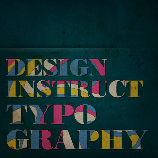
How to Create a Retro-Inspired Typography Poster
In this tutorial I will show you how to create a retro-inspired typography poster design in Photoshop playing with stock photos, blend modes and filters. We will also use a metal grid texture for a grungy background and paper texture to give a nice retro feel to our design.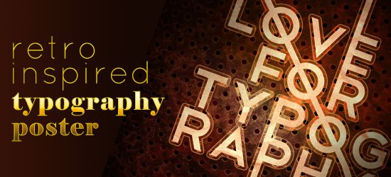
Creating Retro Folded Typography Using Photoshop
In this Photoshop tutorial, we�re going to create retro-looking text that seems like it�s constructed using folded strips of paper. We�re going to step away from the computer a little bit and use a real model as a reference for our project. Prepare yourself to heavily rely on Photoshop�s Lasso Tool, as well as some other basic tools and simple techniques.
How to Create a Retro Boxing Poster in Photoshop
Creating a retrograde look is nothing new, but there are some things to keep an eye out for when mimicking Graphic Design from any decades past. We�ll be drawing inspiration from Poster Design from the 1960s, particularly Boxing Posters from that era. Let�s get started!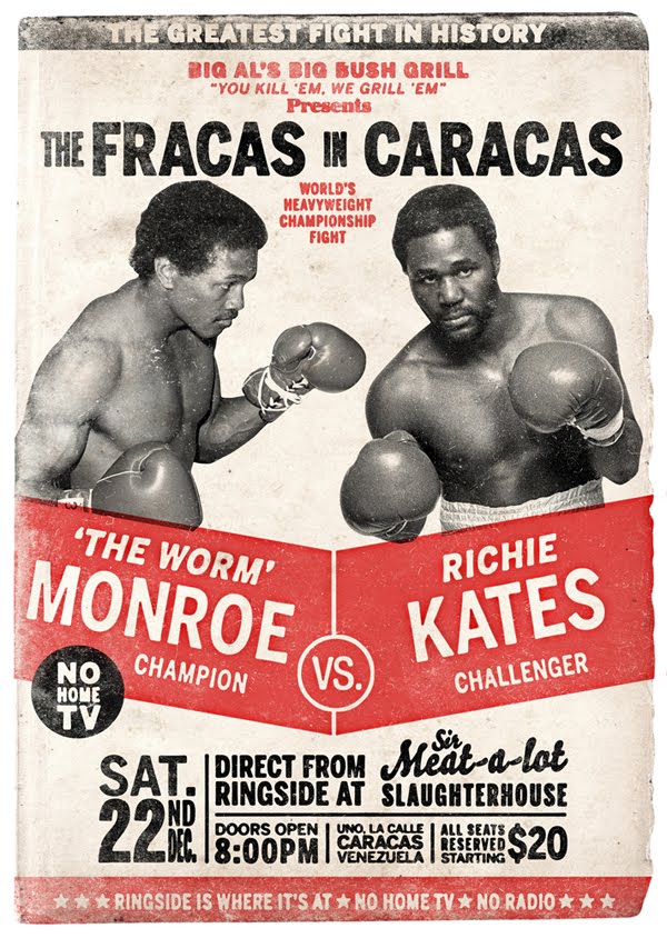


0 comments:
Post a Comment